My favourite composition tools for better pictures

When I first got into photography, in a silly way, I thought that a technically perfect image was good enough on its own. I couldn’t be more wrong.
I quickly realised that composition and light are powerful tools - not just for directing the viewer’s eye, but also for guiding their emotions.
The more I try to tell stories and evoke emotions instead of just showing nice images and beautiful scenes, the more I realise how crucial composition really is.
Composition is a key
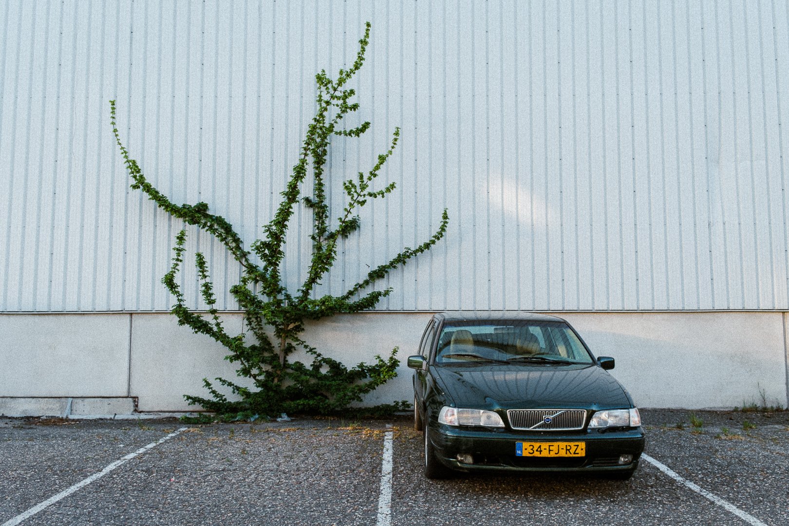
What is a right composition? It’s making deliberate choices that guide the eye and leave space for emotion. Removing what doesn’t need to be there. Simplifying the frame.
Every element in the photo either should add something - or take something away. If it doesn’t serve the image, it becomes noise.
Framing, negative space, light, and depth and so on… all shape how a photo feels.
The most basic rules are central composition and the rule of thirds. While central framing is pretty self-explanatory, the rule of thirds is something worth getting familiar with.
It almost always works when you’re trying to create a balanced arrangement of elements in the frame.
A good starting point is to turn on the grid on your camera and use it as a visual guide when composing. With time, this rule will become second nature, and you’ll start applying it instinctively - no grid needed.
Below are my other 3 favourite visual patterns that I incorporate into my work.
Creating depth through layers

Think of a photo like any other story: to draw you in, it needs a beginning, a middle, and an end.
Layers - foreground elements, mid-ground subjects, or background textures - help guide the eye and build atmosphere and tell the story.
The foreground often acts as the opening - it sets the scene and invites the viewer inside. The subject or middle ground carries the core of the story, where the focus and meaning are. The background wraps it all up, giving context or emotional weight.

You can create depth using light, focus, perspective, or even subtle obstructions like mist, reflections, or objects partially covering the frame.
It's not just about making an image look three-dimensional; it's about adding tension, rhythm, and flow that makes the viewer feel like they’re stepping into the scene.
When these layers work together, the image flows naturally, just like a well-told narrative. Without this structure, a photo can feel flat - even if the subject is strong.
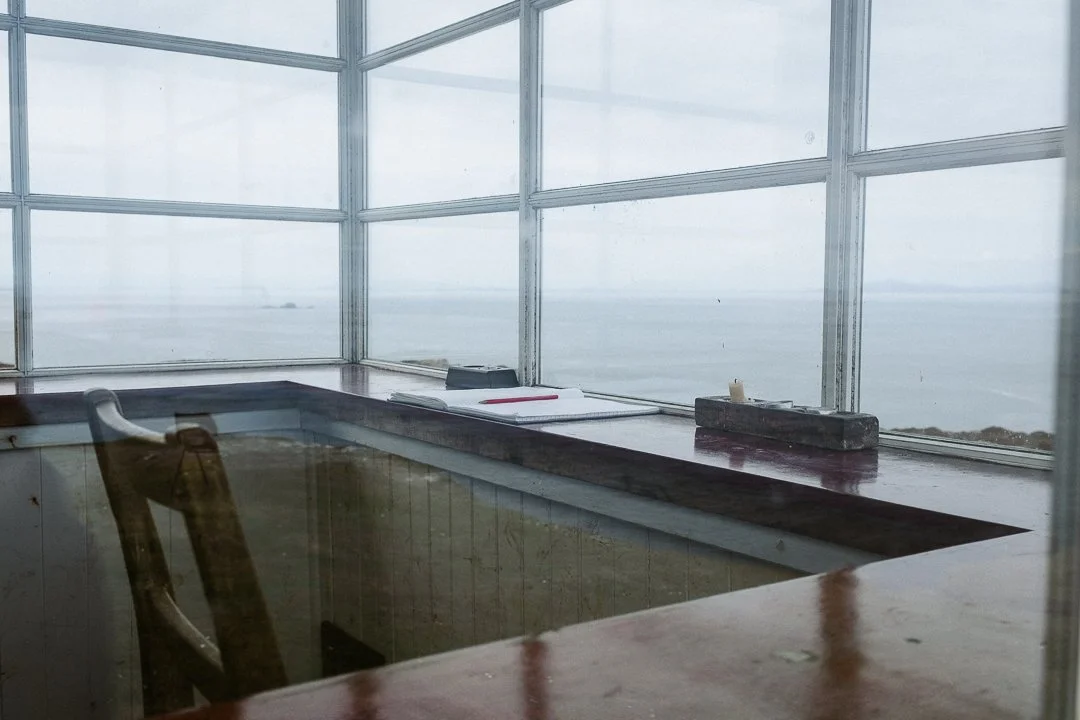
2. Framing within a frame

Framing within a frame is a simple but powerful way to add structure and focus to an image.
Using elements like windows, doorways, arches, tree branches, or even shadows to surround your subject creates a natural border that draws the eye exactly where you want it.

It adds depth and a sense of intimacy. Done well, it can make the composition feel tighter, more intentional, and emotionally engaging. Framing within a frame also helps to isolate the subject and reduce distractions, especially in busy or complex scenes.
This technique naturally guides the viewer’s eye and adds a second layer of storytelling: context. You’re not just showing what is being looked at, but also from where. That shifts a perspective. It places the viewer inside the scene, giving them a role - as an observer looking in, or as someone already part of the moment.
It’s a subtle trick that can make the image feel more thoughtful and deliberate.
3. Leading lines

Leading lines are one of the most effective ways to guide the viewer’s eye through a photo.
Whether they’re obvious - like roads, fences, or shorelines - or more subtle, like shadows or light trails, they help create direction and flow. Straight lines tend to feel strong and purposeful, while curved or diagonal lines add a softer, more dynamic flow.

They can pull attention straight to your subject or move the viewer through different parts of the frame in a specific order.
Good use of leading lines adds structure and rhythm, making the composition feel intentional and dynamic.
It’s not just about pointing, it also creates a visual path that shapes how the image is experienced. When used thoughtfully, leading lines also help build depth by drawing the eye from the foreground into the background, making the scene feel three-dimensional.
What makes a good picture
Good composition subtly leads the viewer through the frame, without them even noticing. That’s where the impact lies.
When something feels off, often, it comes down to composition.
TL;DR how to compose a picture
Composition + light = is a key for turning “nice” photos into emotionally lasting ones.
Simplify the frame - remove anything that doesn’t add to the image; otherwise it becomes noise.
Basic rules that help:
• Rule of thirds + grid as guide.
• Central composition when balance or emphasis is needed.Three advanced composition tools the author likes using:
Depth through layers — foreground, midground, background to guide the viewer’s eye and build atmosphere.
Framing within a frame — windows, doorways, etc., to create focus, context, intimacy.
Leading lines — obvious or subtle lines (roads, shadows, curves) to direct attention and add structure.
Composition choices don’t just affect aesthetics - they guide a viewer’s eye, an emotion, memory and how the viewer experiences the photo.
I created a guide (well, a mini-course is a better word), which will help you make more compelling, clean pictures.
It includes a little bit of theory, example images and practical tips/exercises.
Do you want to start making minimalistic, clean images that stand out? That guide is for you. And yes, it’s FREE.