
How to start editing in Lightroom

If you want to take your photos to the next level, start editing them - you’ll hear this on all social media and photography courses. It’s clear, but how should a beginner, who has never dealt with Lightroom, approach the topic?
One school says to start with presets, but I’m not very convinced if it’s best option.
Presets can be used after getting familiar with the basics. Otherwise, you’ll find yourself in a situation where your photos with a preset applied will all look the same (and just as bad), and you might even feel like someone tricked you because they definitely don’t look like the before-after thumbnail you saw when buying the presets.
To avoid this, it’s best – like with everything – to learn editing yourself, step by step, starting from the basics. And again, the common rule is: the more you edit, the easier it becomes.
CORRECT EXPOSURE
It’s no coincidence that the part of Lightroom responsible for exposure correction is at the very top of the Develop panel and is called Basic.
By the way, at the beginning, I think it’s worth using the editing tools in the default order proposed by Lightroom. It’s quite an optimal and logical sequence.
Exposure is a fairly subjective concept - like many things in photography or art in general. It’s supposedly governed by some rules, but in the end, what matters is what you like.
However, you should always remember certain principles of correct exposure, the minimum that will ensure your photos look better after editing than before, and not the other way around.
Rule no 1:
Exposure editing in Lightroom should only be a tuning of a good photo. The photo should already be correctly exposed when taken with the camera. That means it shouldn’t have black or white areas that indicate the photo has been overexposed or underexposed. These are parts of the photo where there is no information.
Everything else can be fine-tuned according to your preferences.
Rule no 2:
Just because Lightroom has a whole bunch of sliders responsible for many things doesn’t mean you should use all of them. In fact, I would argue that you should avoid overusing them.
Often, a subtle adjustment is enough to highlight specific aspects/a subject or mood.
Rule no 3:
In order to move in the right direction with editing, you need to know where you want to go. That means, before you start editing a photo, think about what kind of mood and effect you want to achieve. Should the contrast be strong, or the colors be faded? Do you want to emphasize shadows or the highlights, etc.?
This should always be your starting point.
MY WORKFLOW - EXPOSURE CORRECTION
I start my edits with cropping and correcting the horizon. Next, I look at the white balance. Since I often have it set to automatic, I either make a slight adjustment or don’t touch it at all. It usually fits the situation I photographed, just as I remember it.

Here, the subject of the photo is light and fog. My intention was to emphasize the soft, diffused light. I wanted to bring out the details from the shadows, but only minimally. I didn’t want the shadows to steal the show.

This is a common mistake for beginners: pulling details from shadows by pushing the slider all the way to the right. I am guilty of that, too.
What gives me more control on highlights, shadows and black and whites is the curve. And this is where I usually go next.

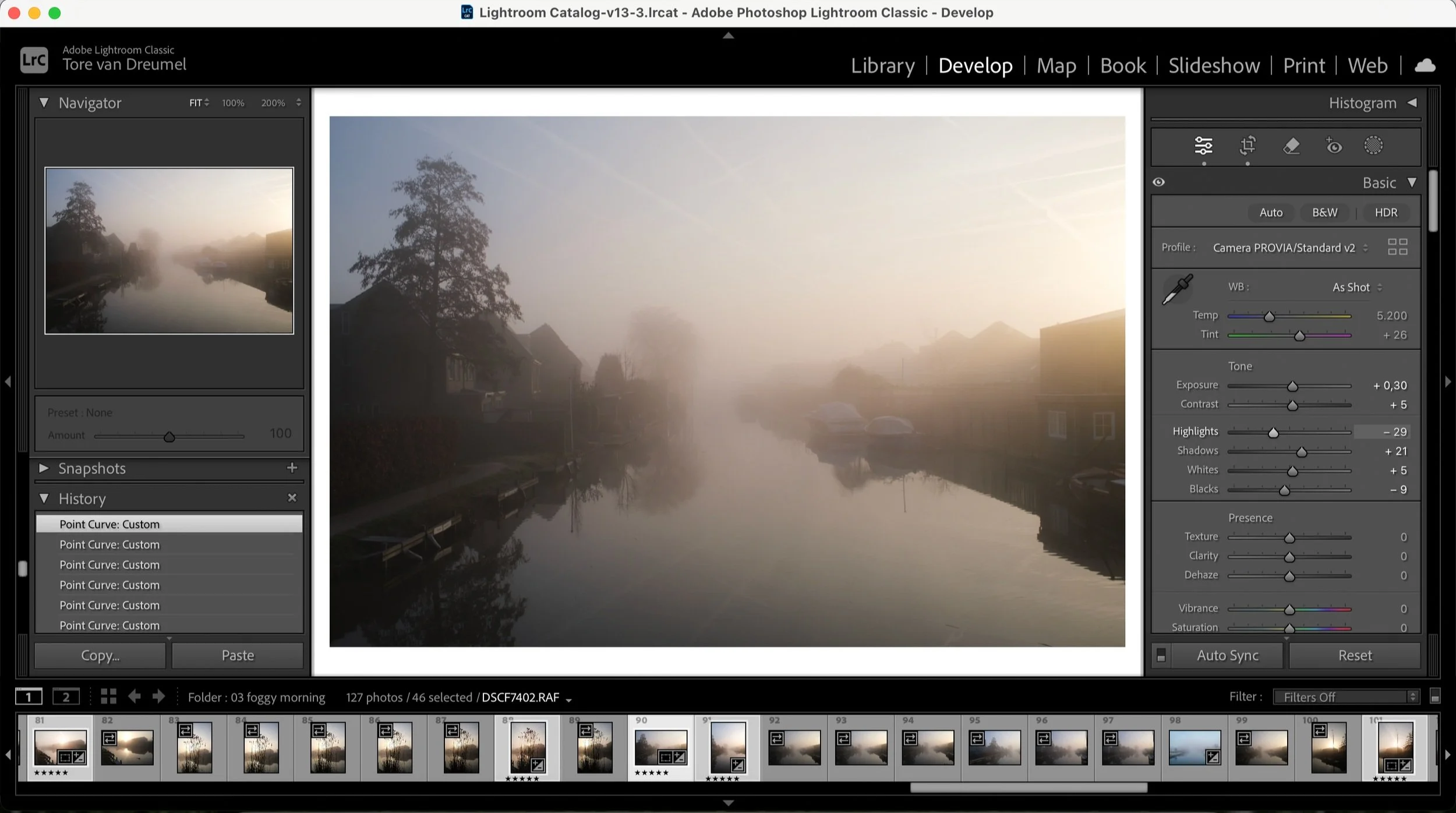
After that I fine-tune black and whites with the sliders. And here ends my intervention in the light on the photo at the basic, global level.
Texture, clarity, dehaze - be aware of not moving this sliders too much, as it’s the fastest way of screwing your picture and giving it very unnatural look. What works the best for me, is leaving them on a slight minus position, for the soft look.
Saturation and vibrance - these two treat all the colors globally. Most often I don’t even touch them, but there - as it is a quite monochromatic images - I wanted to give it a little boost.
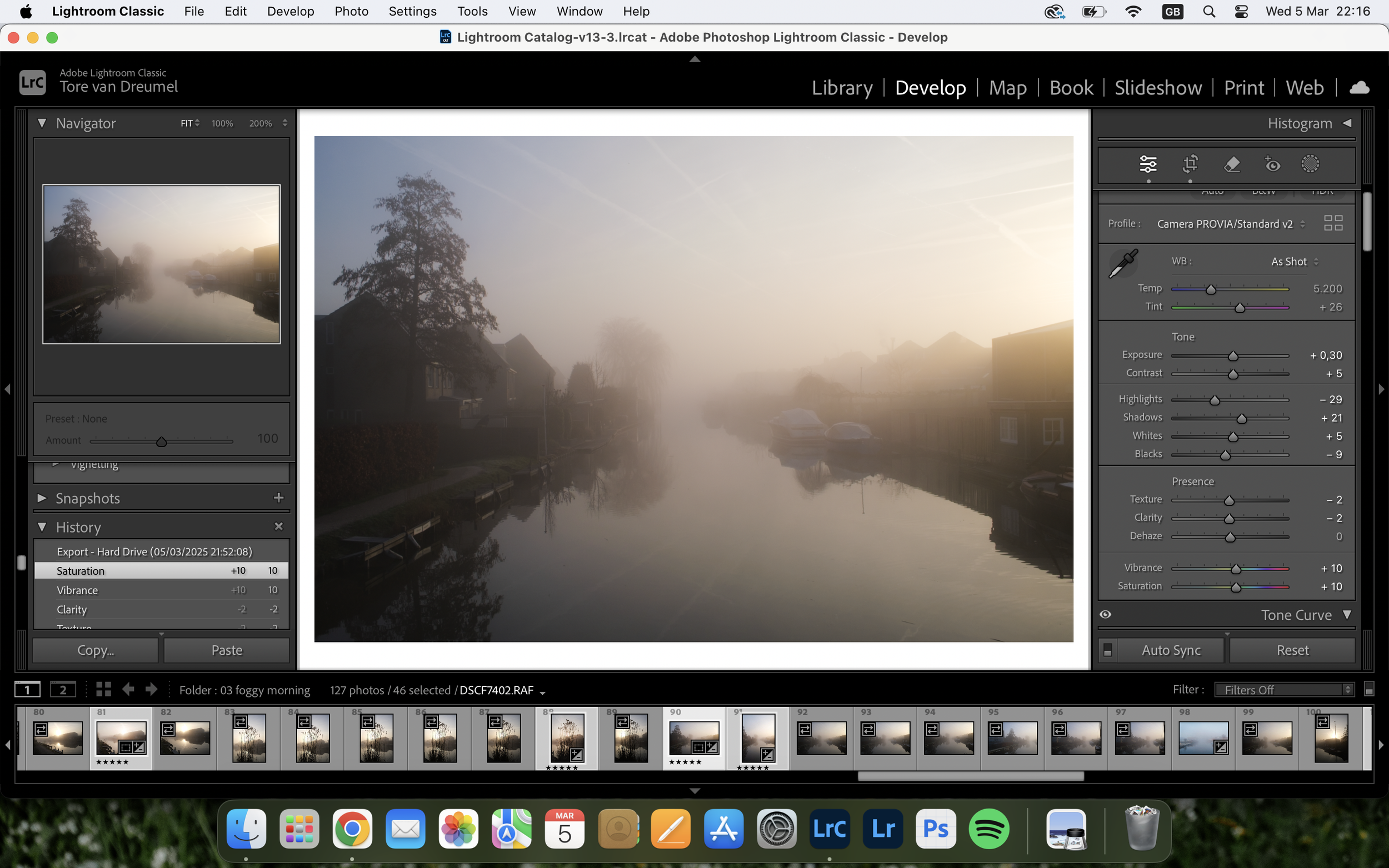
The next step is about playing with colors seperately - here, I decide not only on hue and saturation, but also on the luminance of the color. The HSL panel is a more complex topic for another time though.
An easy starting point for your edits
I’ve put together a collection of Lightroom presets based on the kind of colours and tones I like in my own photographs. They’re made to give you a solid starting point while still leaving room to make the edit your own.